
Branding Transit Systems with Purpose
When it comes to public transit, design is often the unsung hero. But for Gamaliel Anguiano, also known as G, the creative force behind Santa Maria Regional Transit’s (SMRT)’s rebrand, designing transit with purpose isn’t just about aesthetics but about trust, inclusion, and long-term community impact. We spoke with G about what it means to brand transit systems with purpose, and how thoughtful design can elevate rider experience, build public confidence, and reflect the identity of a region.
From naming strategies to livery clarity, his insights shine a light on the value of investing in quality branding, not for flash, but for function, connection, and culture. At Seifert, we’re honored to support agencies like SMRT in bringing that vision to life.
Seifert: What sparked your passion for transit branding, and how does your approach aim to elevate public service through design?
G: My passion stems from a belief that transit is a vital public service, and its visual identity should reflect that importance and not treat transit like a city’s side service. A strong livery isn’t just about aesthetics; it’s about building trust, creating a sense of community ownership, and conveying the system’s efficiency and reliability. A well-designed livery transforms a bus from a mere vehicle into a recognizable, respected part of the urban fabric, perhaps even a community icon when done right.
Seifert: You’ve mentioned avoiding common symbols like green leaves or lightning bolts in electric bus branding. How do you approach sustainability in a way that feels thoughtful, timeless, and future-ready?
G: I believe riders are more design-literate and informed than they’re often given credit for. When it comes to electric buses, they already understand the environmental benefits, so the design doesn’t need to “spell it out” with green leaves or lightning bolts. Relying too heavily on those clichés can make the message feel oversimplified.
Instead, I aim for a visual language that’s thoughtful, timeless, and confident. The design itself should reflect the professionalism of the system, not just the technology beneath it. When done well, sustainability is implied through modernity, clarity, and quality, not just symbols.

Seifert: You’ve spoken about wanting transit design to feel timeless, not trendy. What elements or principles guide that balance in your work, and how have partners like Seifert helped support that approach?
G: The key is to focus on fundamental design principles: strong typography, a balanced color palette that harmonizes or enhances with the surrounding environment, and a clear, memorable visual language. We incorporate modern elements thoughtfully, ensuring they enhance rather than overwhelm the core design. Inspiration can be drawn from private industry rather than governmental iconography. The goal is to create a livery that looks as good in ten years as it does today.
Seifert: How does community feedback shape your design process, and what role do partners like Seifert play in translating that into accessible, rider-first graphics?
G: Passenger feedback is crucial, but it’s essential to interpret carefully. While we don’t necessarily design by committee, we do seek to understand how the livery resonates with the community. We focus on qualitative feedback: How does it make people feel? Does it make them feel safe and confident? Does it represent their community accurately? Does this prompt you to reconsider public transit as a viable mobility option? The design must always prioritize the riders’ needs.
Seifert: Looking back at the SMRT project, what made it a success in your eyes, and how did the design contribute to building public trust or pride in the system?
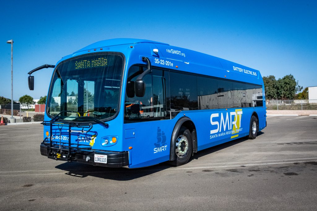
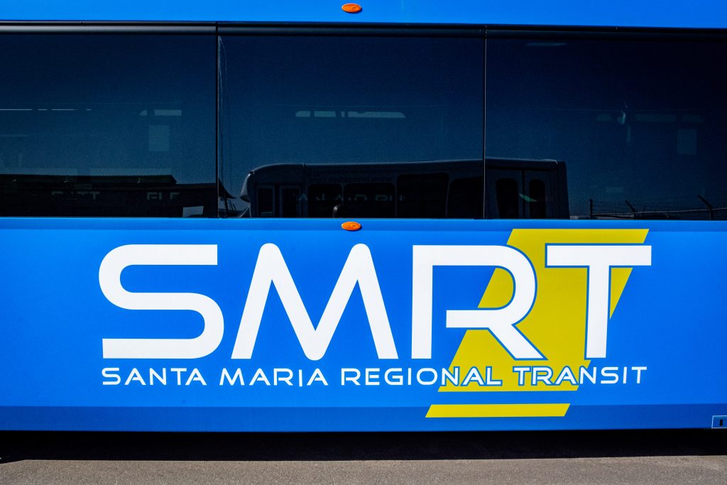
G: I’ve been fortunate enough to have been entrusted with more than one transit agency’s rebranding. A monumental task and honor. Most of my work is based on the idea of revitalizing the image of the transit system to a style that fits the changing demographics and appeal of a newer generation. One project I’m proud of involved a complete rebranding of Santa Maria Area Transit (SMAT) to Santa Maria Regional Transit (SMRT, pronounced “smart”). I know that feels like SUCH A SMALL THING, but I will tell you that encouraging community members to ride or travel SM(a)RT sounds tremendously better than trying to convince them to ride SMAT…
The name change and new aesthetic branding resulted in a system that felt modern, efficient, and cohesive. It fostered a sense of pride among riders and significantly improved the system’s public perception.
Seifert: What trends or evolutions do you think will shape the future of transit branding in the next 5–10 years?
G: I believe we’ll see a greater emphasis on integrated, holistic branding that extends beyond the buses themselves to include stations, signage, and digital platforms. A complete and comprehensive brand identity that fosters a culture built around transit. The focus will be on creating a seamless, intuitive experience for riders. Sustainability will be a core value, but it will be communicated through the overall design’s sophistication and efficiency, rather than simplistic, literal imagery.
Seifert: You’ve helped agencies rework their identities from the ground up. What are some common pitfalls you’ve seen in transit branding, and how do you help guide agencies toward choices that truly resonate with their communities?
G: Naming and branding are big decisions, and one challenge I’ve seen is the pressure to create something catchy—like acronyms or mascots—that don’t always align with the tone or mission of the system. Some cities pull it off, but often these names can feel disconnected or overly engineered.
With Santa Maria, for example, we transitioned from SMAT to SMRT—something that felt more modern, more intuitive, and ultimately easier for the community to adopt. It wasn’t about cleverness for its own sake; it was about creating a name that aligned with the system’s evolution and could earn long-term trust.
I also think it’s important for agencies not to get caught up in chasing trends, especially with electric bus designs. While sustainability is crucial, it’s easy to fall into visual shortcuts that date quickly. Strong branding should outlast any single trend and remain grounded in the identity of the community it serves.

Seifert: Accessibility and inclusive design are top priorities at Seifert, particularly in terms of ADA compliance and non-visible disabilities. How do you incorporate those values into your work and ensure that your designs are inclusive for everyone?
G: Accessibility is paramount. We prioritize clear, legible typography, high-contrast color palettes, and intuitive wayfinding systems. We also advocate for the use of universal symbols and multilingual signage where appropriate. We design with the understanding that a successful livery must be inclusive and welcoming to everyone.
Seifert: What is the most rewarding aspect of your work in transit branding?
G: The most rewarding aspect is seeing how a well-designed livery can positively impact a community and change people’s minds about riding public transit altogether. When riders feel that we care about their experience, they develop a sense of pride and ownership in their transit system, which fosters a stronger sense of community and encourages greater ridership. It’s about more than just aesthetics; it’s about building a better, more connected city.
Seifert: You’ve worked with multiple transit agencies on rebrands. What advice would you give to systems considering a refresh, and how can working with a partner like Seifert help bring that vision to life?
G: Invest in professional design. Don’t underestimate the power of a strong visual identity. A well-executed livery is an investment in your system’s future and a reflection of your commitment to your community. Treat it with the respect it deserves.
——–
As transit systems evolve to meet the needs of modern riders, it’s clear that visual identity plays a larger role than ever before. From the fonts we choose to the symbols we avoid, every detail communicates something deeper: who we serve, what we value, and how seriously we take public trust.
G’s thoughtful approach to design reflects what we believe at Seifert Transit Graphics—that branding is not just about what buses look like, but how they feel in the public space. It’s about clarity, pride, accessibility, and the quiet confidence that comes from a system built to last.
We’re proud to partner with forward-thinking agencies and designers like G who see transit not as an afterthought, but as a living symbol of public service done right.
If your agency is planning a rebrand, exploring a fleet refresh, or simply thinking about the next chapter of your visual identity, we’re here to help you build something that resonates for the long run, like we’ve done with G and SMRT.