

Tracing the Evolution of Transit Design Standards
Transit has always reflected our progress, inventiveness, laws, culture, and how we support one another. From horse-drawn carriages to today’s electric buses, the world of public transportation has continually evolved as humans desire to go further and faster. Alongside the development of vehicles and routes, the visual language of livery, signage, and decals has become more deliberate, accessible, and human-centered, promoting safety and accessibility across transit systems.
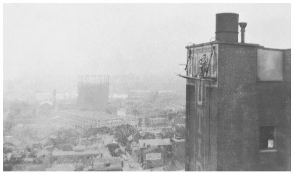
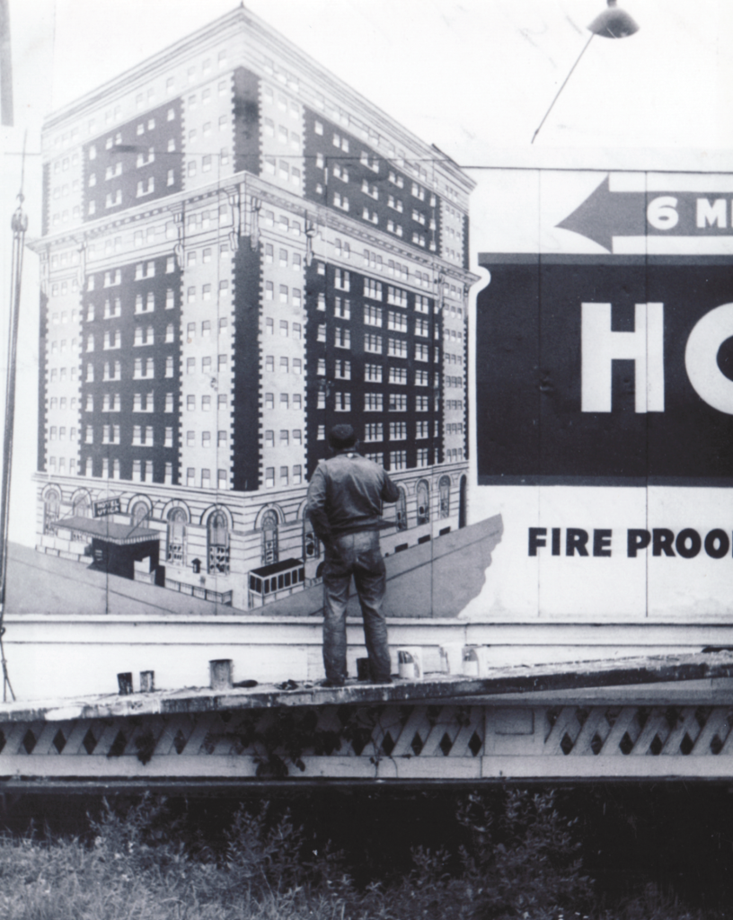
Seifert Transit Graphics has been part of that story for many decades now, from humble roots in hand-painted signage on buildings and painting numbers on buses to vinyl printing, setting design standards for safety decals, and designing livery for major transit agencies around the United States.
We believe it helps to look back and see how far we’ve come, gaining a sense of where we’re headed in the evolution of transit design. Let’s take a look at some key moments and innovations that have led us to our current design practices and standards, plus speculate a bit about what’s coming for the transit industry.
Expanding Transit Graphic Design through Function and Form
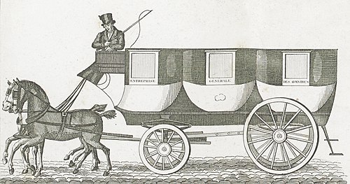
The transit industry began in 17th-century Paris, where scheduled horse-drawn coaches introduced route consistency and shared service. By the late 1800s, electrified streetcars and subways had emerged in cities such as Boston and New York, significantly redefining urban transportation in these areas. These early systems relied heavily on hand-painted practical signage to direct crowds in dense areas, becoming an early nod to what would become intentional design in today’s urban sprawls.
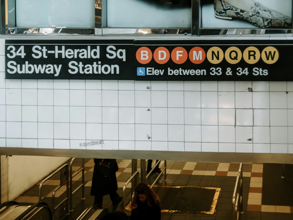
The 1960s signaled a design revolution for the transit world. The Urban Mass Transportation Act of 1964 provided federal funding, leading to the expansion of transit networks nationwide. Simultaneously, graphic design matured. The groundbreaking work of Massimo Vignelli and Bob Noorda led to unified (and now iconic) wayfinding standards in New York’s subway by 1970. Meanwhile, in the UK, Jock Kinneir and Margaret Calvert transformed signage with modern, legible typefaces, such as Transport and Rail Alphabet. Looking around today, you’ll see the influences clear as day with modern legibility defined by these design milestones.
These shifts weren’t just aesthetic; they were about creating accessibility, clarity, and trust. As systems grew more complex, the need for intuitive, rider-friendly design became essential. Passengers had to navigate new transfer points, multimodal hubs, and expanding service maps as populations grew. Consistent signage and livery became essential tools for wayfinding, especially for new riders, tourists, and, more recently, individuals with visual or language-based challenges. The lessons from this era laid the groundwork for the clear, thoughtful design standards that continue to shape transit graphics today.
As transit matured through the 20th century, the vehicles themselves became more than just people-movers but public symbols. From the iconic red double-deckers of London to New York’s checker-patterned taxis, fleets began carrying not just passengers but identity. This shift toward system-wide branding was born out of necessity, as growing cities needed consistency; however, it also became an opportunity for pride and recognition. Visual communication evolved from simple route numbers and paint to unified color schemes, logos, and eventually, wrap designs that could flex with service changes, seasonal campaigns, revenue opportunities, or cultural milestones and celebrations. Public transportation became more than just a service; it became a beacon of activity and possibility within cities themselves.
From Paint to Peel: The Rise of Vinyl in Transit
In the 1920s, Waldo Semon developed a method to make PVC flexible, laying the groundwork for the vinyl we still use today. However, it would take decades (and a considerable amount of technology) to transform that invention into what we now call a vinyl vehicle wrap.
Fast-forward to 1993, when German taxi companies faced a legal mandate: every vehicle had to be beige. Instead of repainting their fleets, they wrapped them. The result? Compliance and resale value, all thanks to a company called KPMF. Three years later, the vinyl peeled off like a sticker, leaving pristine paint underneath. A new era had begun.
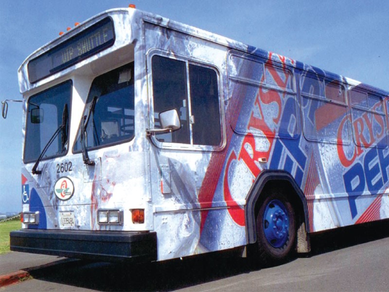
That same year, Pepsi wrapped a bus in vinyl to promote Crystal Pepsi, the first known digitally printed wrap. And once people saw a giant branded bus rolling down the street, revenue opportunities for transit agencies took off.
Still, early vinyl wraps had their quirks. Bubbles. Misaligned panels. Premature adhesion. However, companies like 3M, Avery Dennison, and Oracal revolutionized the industry with innovations such as air-release channels and heat-conforming materials. Suddenly, wraps weren’t just possible, they were practical.
The 90s became a time for us to switch from hand-painted signage to digital printing and develop a focus on the transit industry. By the 2000s, vinyl design had leveled up. Piezoelectric inkjet printers, improved polymers, and innovative overlaminates transformed fleets into moving murals. Whether it was a full-color branding overhaul, a safety striping update, or a tactical paint replacement strategy, vinyl had proven its worth: it was faster, more durable, and more cost-effective.
By 2017, color change vinyl wraps, paint color-matching vinyl wraps, and overlaminates had evolved to include complex and creative graphic designs and advanced colors. Metallic, chrome, color-shifting, and even vinyl wraps that match OEM paint code colors became available. This is important not only for matching paint replacement, which we make easy with our STG numbering system, but also for creating vivid looks for livery designs that enhance branding, revenue generation, and city-wide celebrations.
The Evolution of Transit Design with Increasingly Vivid Livery and Brand Identity
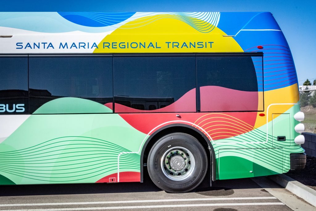
As transit systems evolved, so did the realization that fleets could do more than move people; they could represent them. Vinyl made it easier to update fleet visuals without retiring entire vehicles or undertaking costly repaints. This flexibility allowed for greater precision and experimentation in design by refining logos, improving visibility, or phasing in branding updates fleetwide with minimal disruption. Now that they could, transit agencies began to widen their storytelling through vehicle exteriors, treating buses and trains as extensions of the public identity with custom branding that aligns with regional aesthetics, accessibility goals, or cultural tone.
In Los Angeles, the introduction of the Tri-Stripe and Yellow Jacket liveries marked a turning point. These weren’t just color schemes, but intentional brand identities that helped unify the Metro system across a vast region. Cities like Portland with TriMet’s minimal modernism, Miami-Dade’s bold green striping, and Dallas with DART’s geometric pulse become a language of civic pride and symbols of home, whether near or far.
Strong branding is a hallmark of well-run transit systems. It reflects professionalism, builds passenger trust, and provides a visual throughline that helps riders navigate their journey. From typography and decals to color systems and maintenance protocols, fleet branding is now understood as a core operational asset, not a finishing touch. At Seifert, we support this evolution by helping agencies craft durable, modular, and intentional livery designs that stand the test of time, and installing them with precision, to properly reflect both the character of a place and the care behind its service.
Seifert’s Contributions: Livery, Print, and Safety
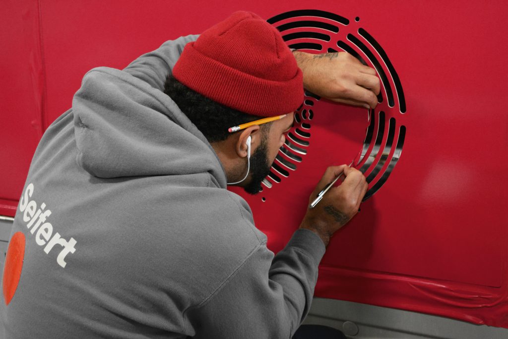
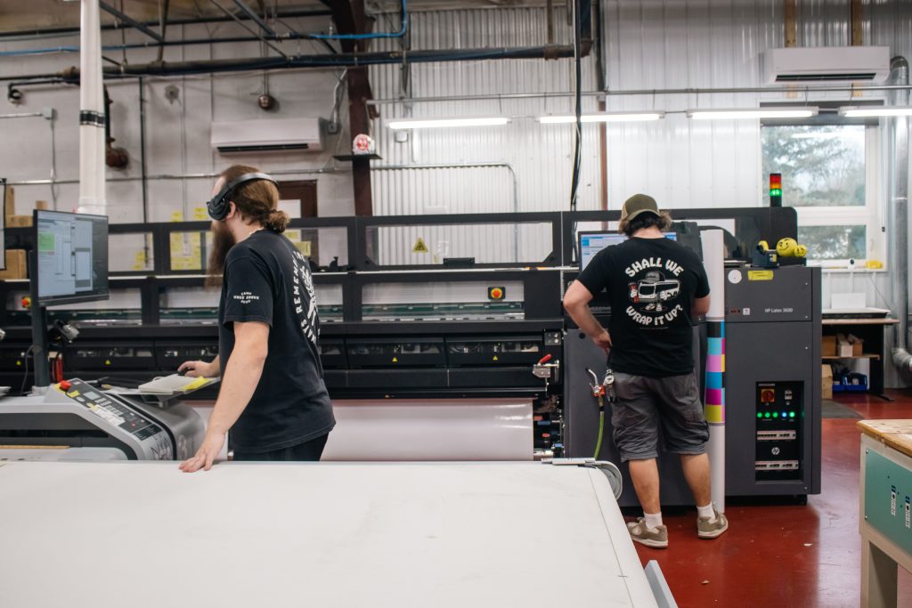
At Seifert Transit Graphics, we’ve embraced the evolution of the industry by adding services to support our customers’ evolving needs, which includes installation training as maintenance teams and directors make the switch from paint to vinyl. Our fleet graphics and livery solutions utilize durable materials and high-resolution print techniques, combined with wise material choices, allowing for seamless revenue-generating advertising to be transferred on and off without issue. We ensure that each vehicle features consistent, eye-catching designs that align with agency branding, support compliance, and serve riders effectively.
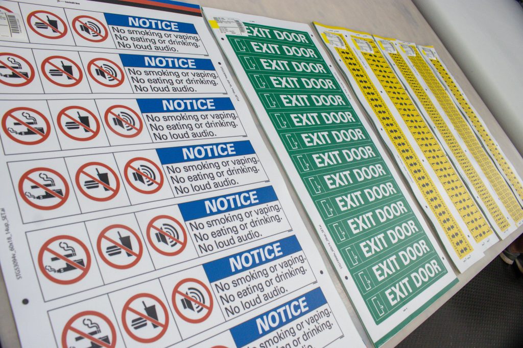
On the inside, we specialize in signage that anchors safety and respect. From operator assault decals to ADA and non-visible disability markers, our expertise lies in thoughtful layout, high-quality materials, reliable service, and precise use of adhesives like STG Vigor™. Our safety decals are designed to endure daily transit demands without compromising clarity or rider trust. And we’re never pushy about any of it, because we know what it’s like to be sold something you don’t need or want. Our goal is to be a guide and provide only the services you need to continue building stability and presence in your city.
Defining The Transit of Tomorrow
The future of transit in the United States is arriving with a remarkable sense of purpose, and it will likely reshape how agencies think about branding and signage.
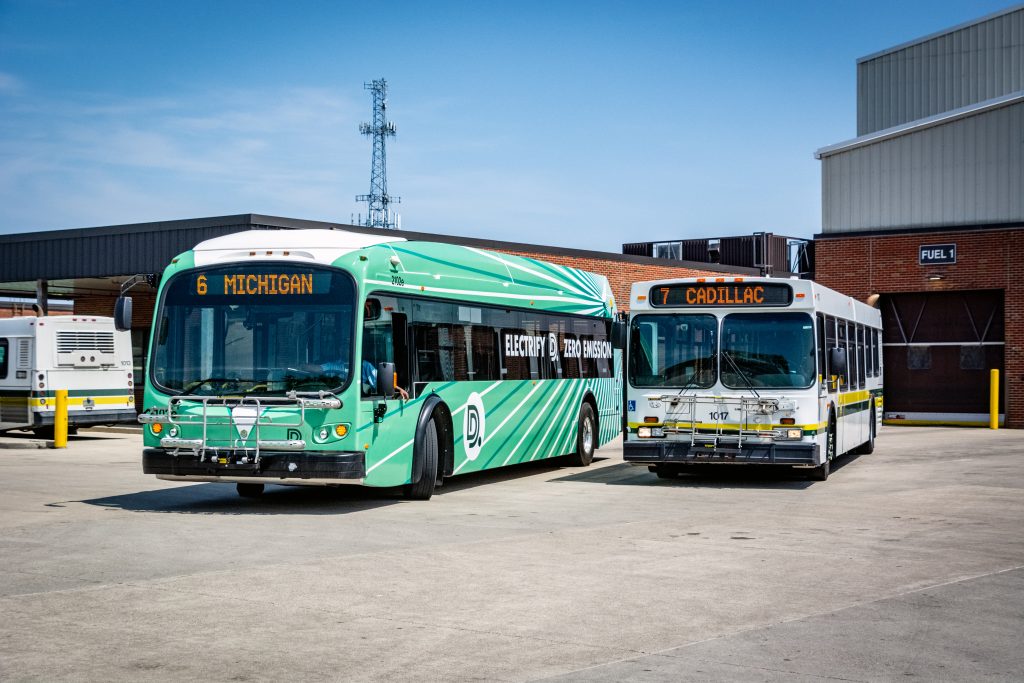
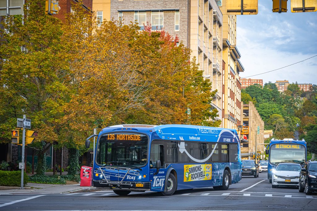
Electric buses are no longer just pilot projects. According to CalStart, there are now more than 7,000 zero-emission buses operating across the country, a 14 percent increase from last year. We know because we’ve designed a few and decals to match. Electric fleet adoption is accelerating in states such as California, New York, and Florida, and even school districts are embracing electrification, thanks to major federal grants and state-led initiatives that encourage the change. We’ve already seen bus manufacturing evolve with alternative fuel types and livery designs updated to display electrification, showcasing excitement for clearer skies and smoother rides.
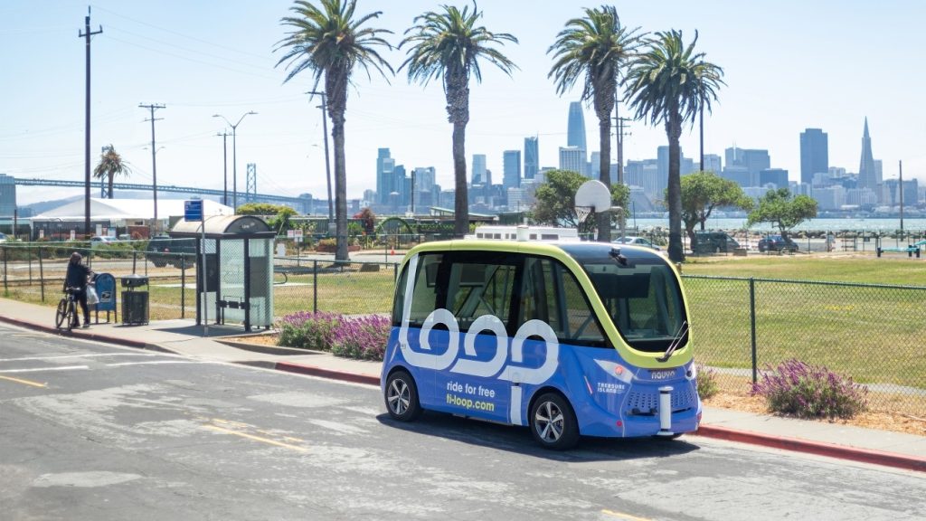
Meanwhile, driverless and autonomous shuttles are also being rolled out in real-world contexts, from Treasure Island’s circular pilot in San Francisco to university and airport defrayal programs in Denver and JFK. These vehicles aren’t just novelties; they’re something to prepare for, requiring adaptable and tech-friendly visual designs for new kinds of repair, operational requirements, passenger liability, laws, and responsibility expectations, as well as standardization for new decals that flag automated equipment or activities to passengers. Each advancement demands signage that’s not only weather-resistant but also legible, updatable, and integrated into modern rider interfaces, as well as the intentional implementation from career transit leaders like you.
And while fully autonomous transit fleets may still be years away from widespread adoption, it’s not too soon for us to start thinking about the signage they’ll require. As safety protocols evolve, vehicles operating without a driver will likely need new forms of visual communication, both inside and out. That might include exterior decals indicating “Automated Vehicle – Do Not Interfere,” onboard messages discouraging tampering or manual overrides, and instructional signage to reassure or inform passengers during unusual stops or re-routes. These messages must be clear, compliant, and thoughtfully placed to maintain both safety and public trust. It’s one more example of how the future of transit design will continue to intersect with rider psychology, evolving technology, and local culture, and how we’re preparing to meet those changes with practical, well-crafted solutions.
All of this adds up to one clear truth: fleets are evolving, and so must the way they look. New vehicle types, emerging materials, shifting laws, and updated rider expectations will continue to redefine design requirements for years to come.
At Seifert, we’re not just responding to the present. We’re designing for what’s next. Whether it’s new vehicle types, new accessibility needs, or new ways of moving people through their cities, we’re committed to helping you bring clarity, care, and continuity to every ride.
What do you think? Is there a transit innovation you’re looking forward to, and have considered what designs and signage may look like? Is there something from transit’s history that you think will stand the test of time regardless of technological change? Let us know in the comments below!