
Let’s bother our ANSI guru again with some more ANSI questions!
Safety decal design part 2! More excitement! More questions and more answers. This time we ask our guru some design specific questions on how we design using the ANSI Z535 standard.
How did you choose the typeface for ANSI and what is it?
The Z353 defines specific font requirements for safety labels. We chose the Univers family because it not only meets the ANSI requirement, but meets the stroke width ratio requirements for FTA and DOT regulations on certain decals.
How does an ANSI decal catch someone’s attention?
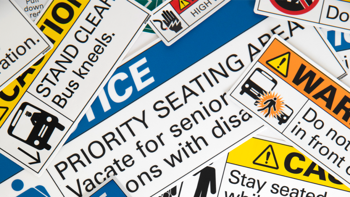
ANSI uses visual viewing distance, alert words and color to define the severity of the hazard. After that, it’s all down to the word message and the symbol being used to warn passengers, operators and maintainers of the specific hazards of a vehicle.
Why are some labels small and others larger?
It’s all about viewing distance. ANSI has a formula to determine the exact font size needed to be legible at specific viewing distances. There are also certain FTA and DOT requirements for font sizes, but we have found if you use the ANSI formula, those requirements are easily met.
Why are there only specific colors?

The Z535 ANSI standard has ten Safety Colors: red, orange, yellow, green, blue, purple, brown, grey, white and black. Red, orange, yellow, green and blue are all used to signify certain levels of warning for the label. For example, yellow is paired with “CAUTION” in the alert word panel of the label which signifies that the label is alerting of a potentially harmful, but not deadly situation. Green is used for operation instructions and equipment. Each color has a very specific tolerance that must be met to be considered a safety color. The other colors can be used in the symbol design as needed.
How do you design using only symbols?
ANSI has an entire standard on how to properly design symbols for hazards: Z535.3-2011 Criteria for Safety Symbols. The standard reviews examples and defines methods for designing symbols. Most of our standards include a human figure symbol. The standard has guidance on the specific pivot points that help us design him to be in the poor situations he is always in. There are also great references for other parts of the human body, like the hands, feet and head.
Why not use photographs?
Most photographs are visually busy. When designing with ANSI the goal is easy identification and easy legibility. That’s why we only use symbols!

What do the different words mean at the top?
Directly from Z535:
DANGER: Indicates a hazardous situation that, if not avoided, will result in death or serious injury. This signal word is to be limited to the most extreme situations.
WARNING: Indicates a hazardous situation that, if not avoided, could result in death or serious injury.
CAUTION: Indicates a hazardous situation that, if not avoided, could result in minor or moderate injury.
NOTICE: Indicates information considered important but not hazard-related.
How do you compose the word message?
Use an active voice, avoid prepositional phrases and write in a headline style. If necessary, you can emphasize certain words by CAPITALIZING them or separating information if there is more than one.
Do I need to have bi-lingual messages?

ANSI does not require bi-lingual messaging but we always tell customers to refer to their local government for guidance on multilingual messaging on their public transit vehicle.
Thanks for joining us on this ANSI Q&A journey! Feel free to post some questions in the comments since we love to keep our ANSI guru fully pestered at all times.
You must be logged in to post a comment.